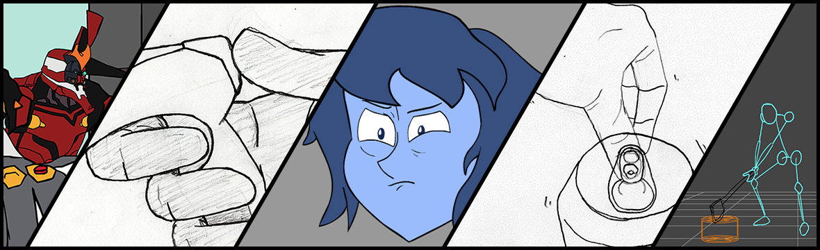
It’s ready:
animation progress update
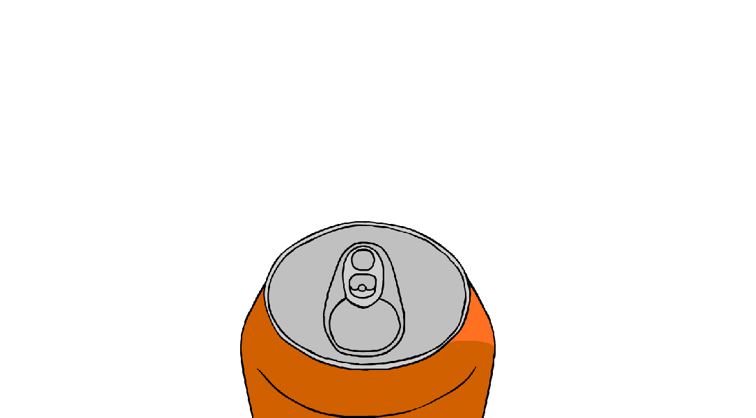
Yep, i’m working hard on Pearl, vs. A Can. if you notice the production schedule, i’ve been mostly keeping on top of it, excepting when i needed to prioritize other pieces to make a miniature portfolio for last week. I’m up to date now, though i needed to edit the schedule, because we actually have one less week than the academic calendar would have suggested.
Still, the last bits of work shouldn’t be too demanding for this timeframe. I’m very glad that January Patrick chose this project for its shorter length, compared to the decisions made by September Patrick for the Fall semester.
I’m getting to be pretty proud of this piece as it comes together, too. Whereas the average scene of the Eleventh Angel Project didn’t have much ” ” ” animation ” ” ” (so to speak, there were a lot of shots of static imagery given motion tweens), Pearl, vs. A Can has frame-by-frame animation in every shot. Also it has much hands!!
In my last post, I said i would add previews of the animation ‘tomorrow.’ So just imagine my calendar goes April 19th -> April 20th -> May 2nd. Like there’s one really long 264-hour day in place of April 21st-May 2nd, one day with eleven sunrises and sundowns.
update on various works
You might have noticed today i posted six ‘inspiration’ posts. today was the day i needed to catch up with that part of the course rubric, filling in for each week of class that i didn’t post a reference work earlier in the semester.
Here’s what’s going on with me though: production of my Pearl short is coming along, though a little behind schedule (<- I update this page whenever i make progress on it though). this is because i needed to take some time to go back over some old works and get some files together which my professor is going to send to some professionals for critique–which is quite exciting!
One of the things i want to include is my little head-turn animation of Lapis. So i’ve nearly finished that:
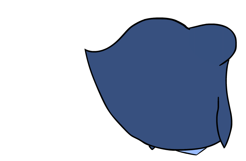
this is after taking my prof’s criticisms into mind. i made distinct the locks of hair in the front and the hair on the sides of the head, such that they lie up against one another when she’s not moving, but separate during a motion. She still needs a mouth, though.
I can post some updates tomorrow showing each shot as i’ve been working on them in the Pearl VS. a Can short, as i haven’t shown off any work from that in a long while.
References & Inspiration: Pepe Silvia
YouTube animator Worthikids published this last month, an animation of a hilarious scene from It’s Always Sunny in Philadelphia. Just like the animations I’ve linked here of segments of Let’s Plays and podcasts, it’s always really fun to see how the artist sneaks in their own gags to the scenes. My favorite gimmick is the 3D Charlie models that are left standing in the room and then get bumped around in zero-g as Charlie moves through the space. Mac’s giant coffee mug is also funny, since in that episode part of the issue is that the two of them are nearly hallucinating from the amount of coffee and cigarettes they keep having.
References & Inspiration: Ava’s Demon

The other webcomic I actively follow. Really strong designs and a very pleasant style that can convey melancholy, fantasy worlds, dream states, gritty futurescapes, and fiery demonic possessions. Also quite easy to sit down, start reading, and then forget you were doing something else, thanks to some slick website design.
Start here: http://www.avasdemon.com/pages.php#0001
References & Inspiration: Cowboy Bebop
Another anime I watched with my friends, though this was before Baccano!
This intro showcases strong sense of design and animation work. Silhouettes and shadows in particular play a big role in this sequence, which also combines character illustrations, animation loops, American newsprint, and some bomb music by the Seatbelts. It just oozes style.
References & Inspiration: Robin Hood
Possibly one of my most favorite classic Disney films. Beautiful artwork and wonderful, fluid animation. A relatively low framerate as was standard back then for Disney, but with hand-drawn stuff it still looks great.
Source of inspiration for both my animation and illustration work (It’s also a source for the fan series A Fox in Space, something I did a post on last semester). It contains all those golden Disney principles of 2D animation, and, the rhinoceroses in this scene were what I was nonconsciously taking reference from when I sketched the second concept, the rhino guard, for my portrait project.
References & Inspiration: Baccano!
The opening to Baccano!, an anime from 2007 I watched recently with friends. This is the adaptation from a light novel, and it looks really good. The style is consistent and it does as good a job it can at keeping the characters distinct (there are A LOT of characters), and it was a very good idea to repeat their names with their faces for the intro, as you will need help remembering them all at first.
I really like the animation in this series. If I had to pick out one issue, it would just be in the beginning of the intro where Miria points with her right hand at the bag. It looks really wonky without any other part of her body moving with it.
References & Inspiration: Breath of the Wild Artwork
I’ve talked already about how I love this game. One reason: the artwork.
In the first four images you can see the team’s official promotional art. It’s like digital gouache, really pretty. In motion, the game resembles this style remarkably well, especially when viewing landscapes from a distance. The textures, lighting, and shaders all contribute to the feel with irregular edges and brush-like strokes of color.
The last three images demonstrate their application ofan ancient Japanese style of sculpture known as Jomon. It is the inspiration for the designs of the ancient ‘Sheikah’ technology in the game, seen on the six-legged laser-firing Guardians, the Sheikah Slate that the protagonist uses, the several massive towers spread across the game world, and the 120 shrines and four dungeon-beasts that the player can explore.


I really like that gouache look. It was the thing I had in mind when I was searching for brushes to paint my Footwomen Doe portrait, providing a direct inspiration.
exercise preview
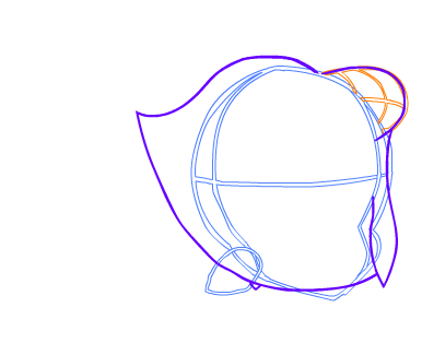
Whipping this WIP out in order to demonstrate motion, change of expression, and fluid volumes (that’s a term, right?)
non-sequitur: Purple is a really nice color to rough lines in, it’s so pleasing to look at
noteworthy critiques: the locks of hair framing the face should either both be connected to the mass in the back, or both be separate. i’m leaning toward separate because i love how they fly around individually
